
The Witch Made Me Watch It
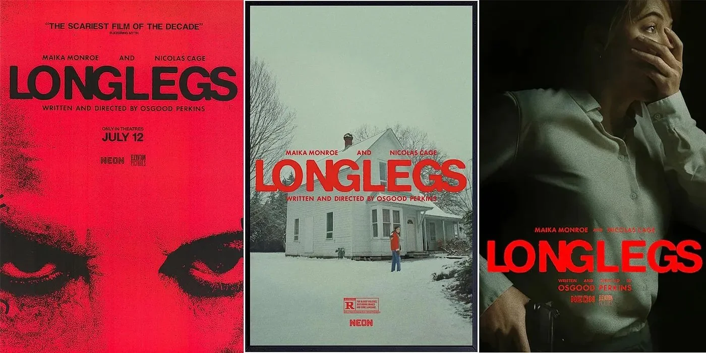
Three posters for 2024’s LONGLEGS, design by GrandSon Creative (NEON)
I’ve always been susceptible to movie marketing. There’s something about a well-designed poster that satisfies an urge, a craving, a desire to believe, “Jeez, if the ad’s this good…”
My impetus for writing this piece was the campaign for this past summer’s Longlegs, the horror film directed by Osgood Perkins. The marketing featured a series of posters that, in their own unique way, were designed to frighten you. The online campaign was no different, with one William Castle-style gimmick that allegedly featured the heartbeat of the film’s star Maika Monroe as she encountered her titular nemesis (Nicolas Cage) for the first time. Spoiler alert: it was racing. Message: when you see this film, yours will be too.
I’d like to think my appreciation for design and branding is what made me want to make a living in the business. I’ve spent a good chunk of my life working with graphic designers, digital ad firms, and branding agencies. But somehow, nothing gets me going like a well-made trailer, a teaser campaign, or an interactive online experience. Call me gullible, call me what you will, I am the perfect target audience when it comes to selling anticipated films. Throughout this piece, I’ll be calling out various aspects of great campaigns (in bold), and why those features appealed to me.
Before we dive in, let me also say what this essay will not be: and that is, a scholarly treatise on the history of movie marketing. I’m only going to cover campaigns that I’ve experienced personally. Which seems only fair, as they’re the ones that got me where I am today.
Quick note: all posters are credited to the producing studio. I’ve made every effort to credit the designer as well. If a designer credit is not present, that’s because I couldn’t locate it.
As a kid, I was obsessed with movie ads. I’d cut them out of The Boston Globe and tape them into booklets that I’d create from drawing pad paper. Certain ads, those that didn’t impress me, got a half-page, or maybe a third. Apocalypse Now got a page of its own, because, well, it’s beautifully-designed (by Bob Peak), and because it was being screened in 70 mm. I had no idea what that meant, but it seemed like a big deal. (I’m including it here in black & white, because that’s what it was in the Globe. Verisimilitude!)
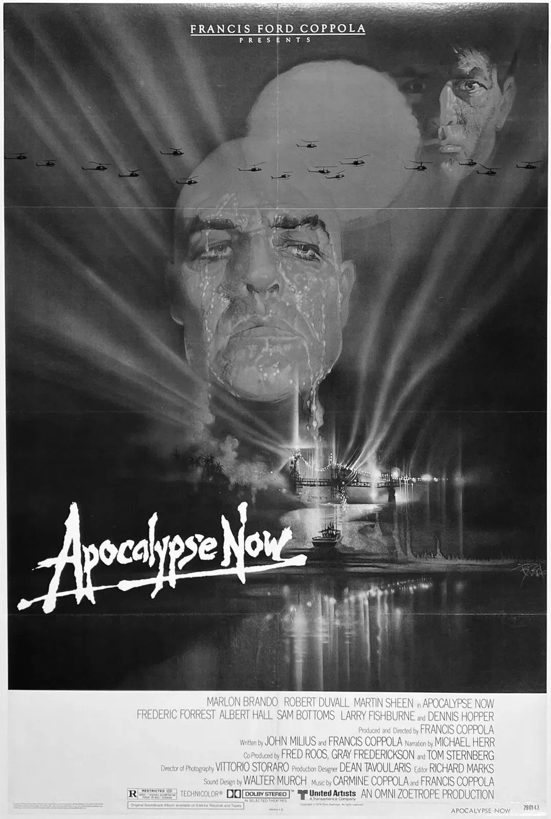
Design by Bob Peak (American Zoetrope/United Artists)
Another film that found its way into a booklet was Star Wars, which I first saw in a movie theater at age nine in 1977. Aside from becoming my favorite film, Star Wars — and yes, I know, it’s Star Wars, Episode One: A New Hope, but I’m calling it Star Wars because that’s what it was when I saw it — also introduced me to the concept of the rebrand.
Back then, unlike today, movies ran in theaters until the box office fell off. Star Wars, being the most financially successful film of the time, ran for over a year, in which I saw it seven times. About a year into its run, the film closed, then was re-released due to popular demand. Someone at Twentieth Century Fox had the brilliant idea to change the poster to keep things fresh. Here are the original and re-release posters side by side.
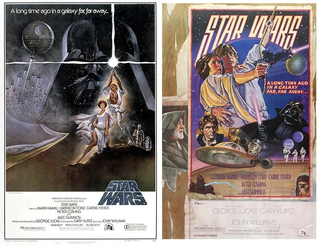
L: Design by Tom Jung; R: Design by Drew Struzan (Lucasfilm)
Different, right? That was the point. For me, it was an epiphany: you don’t have to run the same design for a year. You could play with ideas, change things up, and still capture what was amazing about the film. The poster on the right is unapologetically retro, hearkening back to the Saturday morning serials that partially inspired George Lucas to make the film. (Note the placement of Alec Guinness on a section that looks like it’s peeling off a fence.) Having seen the film at least six times before the re-release, for me it was a perfect evocation of the film’s heroism, romance, and the battle between light and dark.
In the 80s, as I became aware of the power of graphic design, I was especially struck by three examples.
The first came in the winter of 1980. I was eleven. “Marketing” still wasn’t part of my vocabulary, and yet I knew a good campaign when I saw one.

Design by Philip Gips (Warner Bros.)
Did I know what the film was about? No. Did I know who Ken Russell was? No. Did I know who William Hurt was? No — but then, no one did at the time. And yet something about this poster (by Alien and Rosemary’s Baby designer Philip Gips) grabbed me, made me not only want to see the film but also read the book on which it’s based (by Paddy Chayefsky, who famously disavowed Russell’s work and subbed in the pseudonym “Sidney Aaron”). Maybe it was Hurt upside-down, or the title font. Maybe it was the kick-ass tagline — whatever, it sent me down a rabbit hole researching the uses and history of sensory deprivation tanks. (For another essay.)
Incidentally, I saw Altered States a year or two after it came out, at the home of a girl that I was crushing on at the time. She had cable and we didn’t. It remains one of my favorite horror films to this day.
Fast forward: the summer of 1984. The Ghostbusters “I ain’t afraid of no ghosts” logo is on everything. You can’t turn on the radio without hearing the film’s theme song by Ray Parker Jr. or watch MTV without seeing the video. To this 16-year-old kid from the suburbs of Boston, it’s a lesson in the power of iconography. No film had been this ubiquitous since Star Wars, and that summer, everyone had something sporting this logo (by Michael C. Gross). Between the stars, the song, the merch, and — oh, right, the film! — this was as cool as it got.
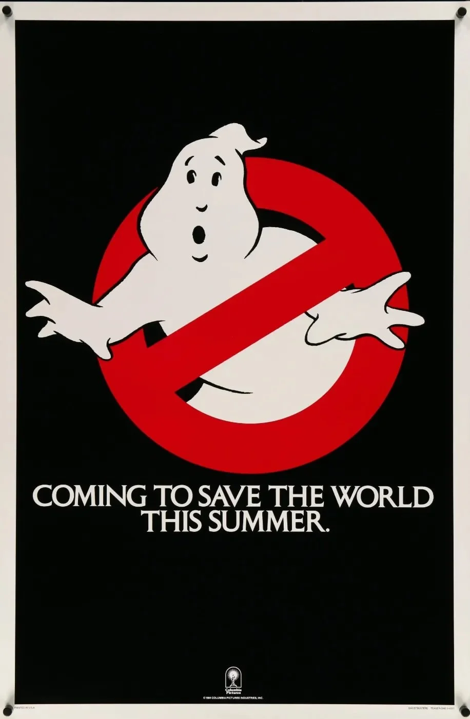
Design by Michael C. Gross (Columbia Pictures)
A year or two later, I became aware of, then obsessed with, the work of Woody Allen. I memorized his standup routines. I wore my dad’s army jacket, because he did. When I wrote my first play in college, I made my characters stutter and stammer as his did, thinking this was actually written into his screenplays. (It was not.)
Back in the 1980s, and well into the 90s, Allen released a film every year, sometimes two, and they were almost universally beloved. He invariably picked up a Best Original Screenplay nomination. Occasionally, he won.
I loved Allen’s films. His posters just as much. There was a spareness to them, an economy of space, a certain Bergmanesque reserve that fit his films perfectly. Most had similar elements: black-and-white imagery, cast list front and center (ABC billing, no hierarchy), and straightforward typography. It’s how I learned that the title treatment can be as important as the image (007 logo designer Joseph Caroff’s Manhattan being the most famous example), and that fonts, when used properly, can become a personal trademark (i.e. the Windsor Light Condensed in all of Allen’s opening credits).
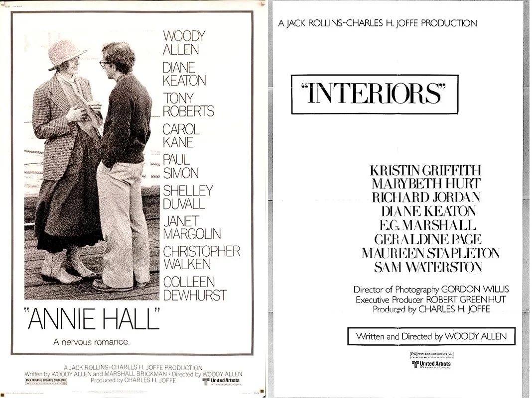
Movie poster: ANNIE HALL (1977) | INTERIORS (1978) — United Artists
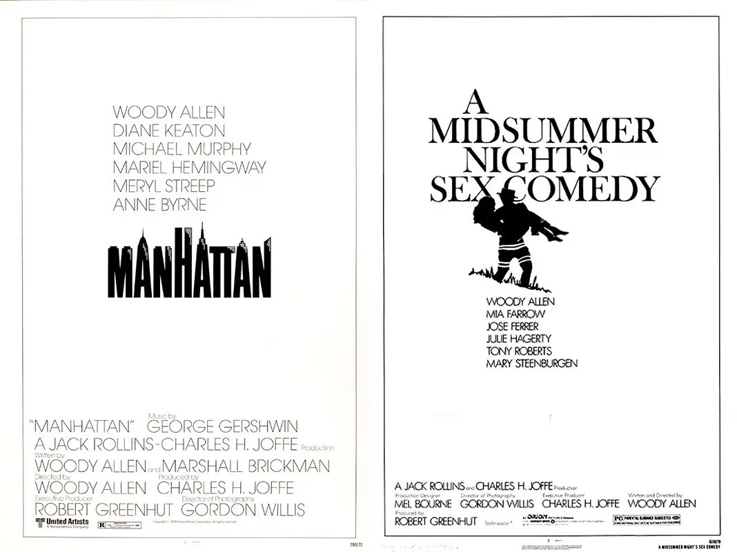
MANHATTAN (1979, design by Joseph Caroff) | A MIDSUMMER NIGHT’S SEX COMEDY (1982) — Orion Pictures
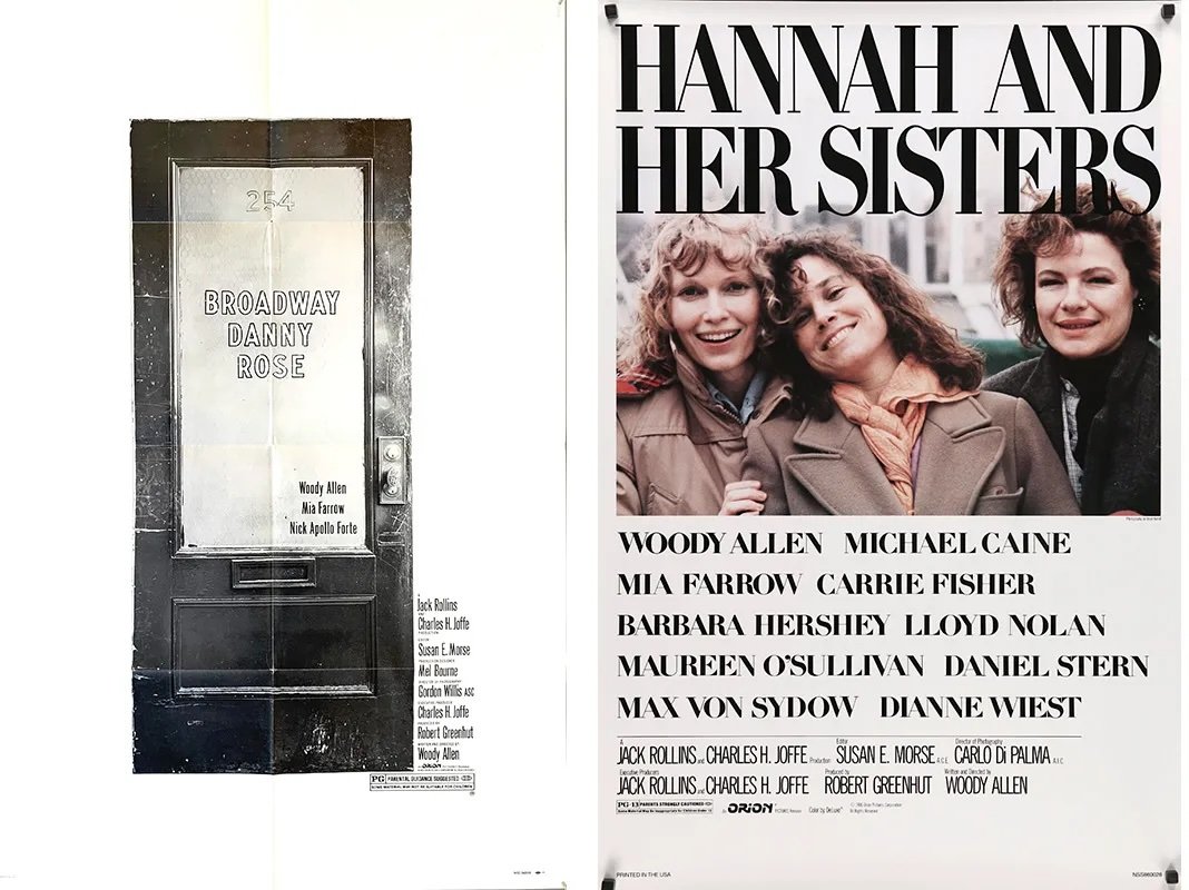
BROADWAY DANNY ROSE (1984) | HANNAH AND HER SISTERS (1986) — Orion Pictures

ANOTHER WOMAN (1988) | CRIMES AND MISDEMEANORS (1989) — Orion Pictures
Stunning, right? I mean, who makes posters like these anymore? What director has the ability to dictate the marketing of their film these days? I may be off-base here; maybe all of them do. But a poster that’s mostly art, with the occasional face, that puts the cast in type almost as large as the title, no matter how well-known? Unheard of in this day and age.
Which brings us, fittingly, to the late nineties. Woody’s still making movies, but the gimmick’s starting to wear thin. Star Wars won’t be back for another year. It’s the summer of ’98, and a kid living somewhere off the N train in Astoria, Queens sees stencils of the Greek letter “Pi” in streets, sidewalks, poles, and posts around Manhattan. As in the mathematical symbol for 3.14, the ratio of a circle’s circumference to its diameter. And he wonders, what is this? Why are math symbols everywhere?
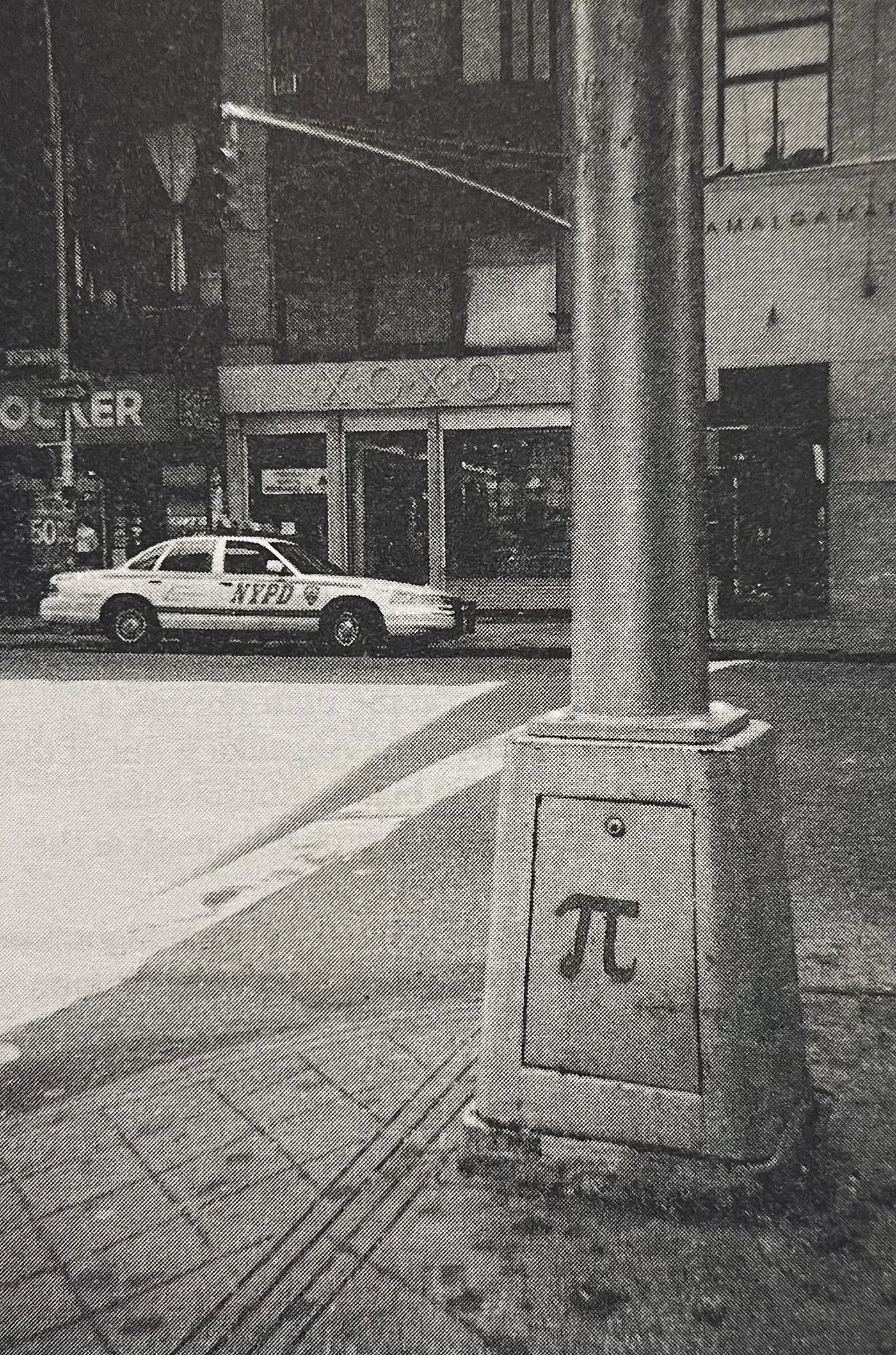
Photo by Darren Aronofsky, from THE GUERRILLA DIARIES (Faber)
It’s his first brush with guerrilla marketing.
I could talk about Darren Aronofsky’s debut film for hours. Crowd-funded, cobbled together on a ($112,000) shoestring, with the cast building sets and his mother serving as craft services, Aronofsky’s film is a true underdog success story. After winning the Directing Award at Sundance, Pi was bought by Artisan Entertainment and released on July 10, 1998, which is the day I saw it at the Angelika Film Center in Manhattan. The takeaway for me, other than the film’s dazzling visuals and cutting-edge soundtrack: sometimes, the street is as good a place as any to push a new film. Aronofsky, a native New Yorker, knew this instinctively, and built significant word of mouth in advance of the film’s release. (The published diary detailing how the film was shot, mastered, and rushed off to Sundance, is essential reading for any up-and-coming director.)
And then it was 1999. The year that gave us American Beauty, The Sixth Sense, The Matrix, Toy Story 2, The Green Mile, Three Kings, Fight Club, The Talented Mr. Ripley, The Insider, Magnolia, The Straight Story, Boys Don’t Cry, Galaxy Quest, Election — and three films whose campaigns furthered my education.
On July 16, 1999, the night it premiered, my then-girlfriend and I saw Stanley Kubrick’s Eyes Wide Shut in a packed Times Square cinema. The anticipation surrounding the film — with its A-list stars, extended production period, and the fact that Kubrick had died a few months earlier — was off the charts. Being me, I fell for the billing: it was the first film (that I know of) whose poster included the director’s name alongside the stars, in the same-size typeface. It’s possible that this was a tribute to Kubrick. Few would disagree that he’d achieved this level of fame; still, it was remarkable to see a director elevated in this way. (Sadly, the film left more than a few folks scratching their heads)
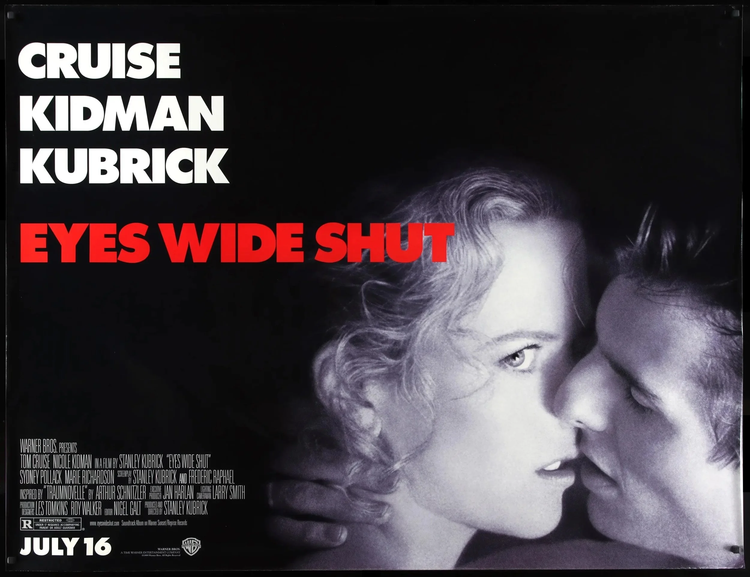
Design by Katharina and Christiane Kubrick (Warner Bros.)
Two weeks later, on Friday, July 30, 1999, the then-girlfriend and I saw what would turn out to be the scariest movie I’ve seen to date: The Blair Witch Project.
I don’t recall how I heard about this found-footage masterpiece; it was definitely buzzy, and the buzz had an additional, enticing element: a website. A week or so earlier, late one night in my Astoria, Queens studio, I’d dialed up the site and was treated to a supremely spooky experience: the complete backstory of the Blair Witch and the three hapless filmmakers who allegedly disappeared while looking for the legend. The site contained shots of the filmmakers’ recovered gear and equipment, as well as sound not heard in the finished film. As an enticement, it was brilliant. (The site is no longer active, but thanks to the Internet Archive, you can view a few pages below and online.)
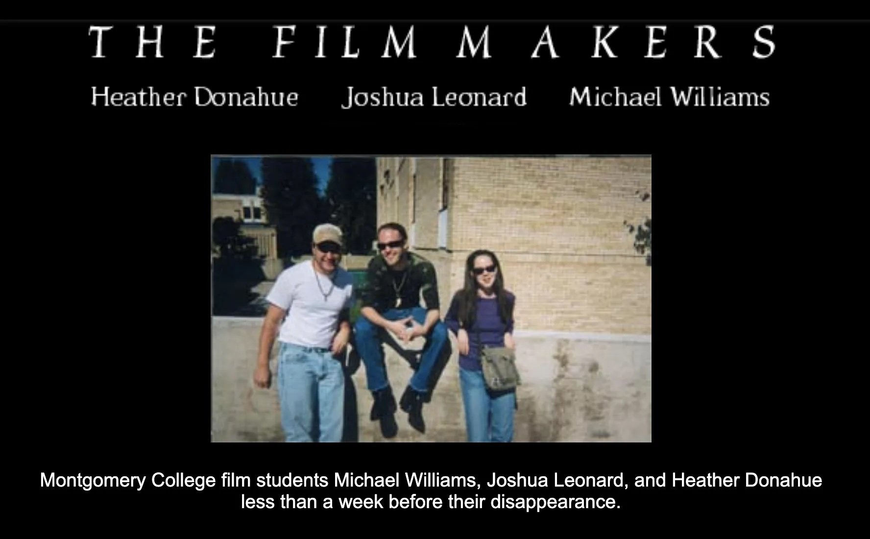
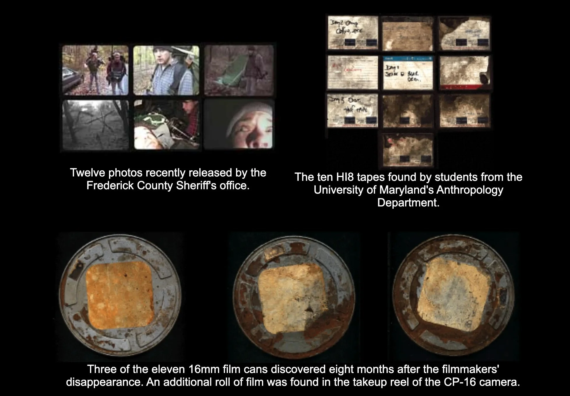
(Artisan Entertainment/Haxan Films)
The site was, for its time, remarkable, one of the first to be used effectively in a film’s marketing. Now, if we chose, we didn’t have to go in blind. We could immerse ourselves in the creators’ world. You didn’t have to explore the site to understand the film, but it certainly enhanced the experience.
And then it was the fall. Towards the end of every summer, The New York Times publishes The New Season, a preview of coming attractions in the fall and beyond. I look forward to this section because it contains the first (usually full-page) ads for films about which I’m genuinely excited. When I opened the paper in August ’99 and saw the ad for Spike Jonze’s Being John Malkovich, I immediately cut it out and stuck it on the door of my studio apartment’s tiny bathroom.
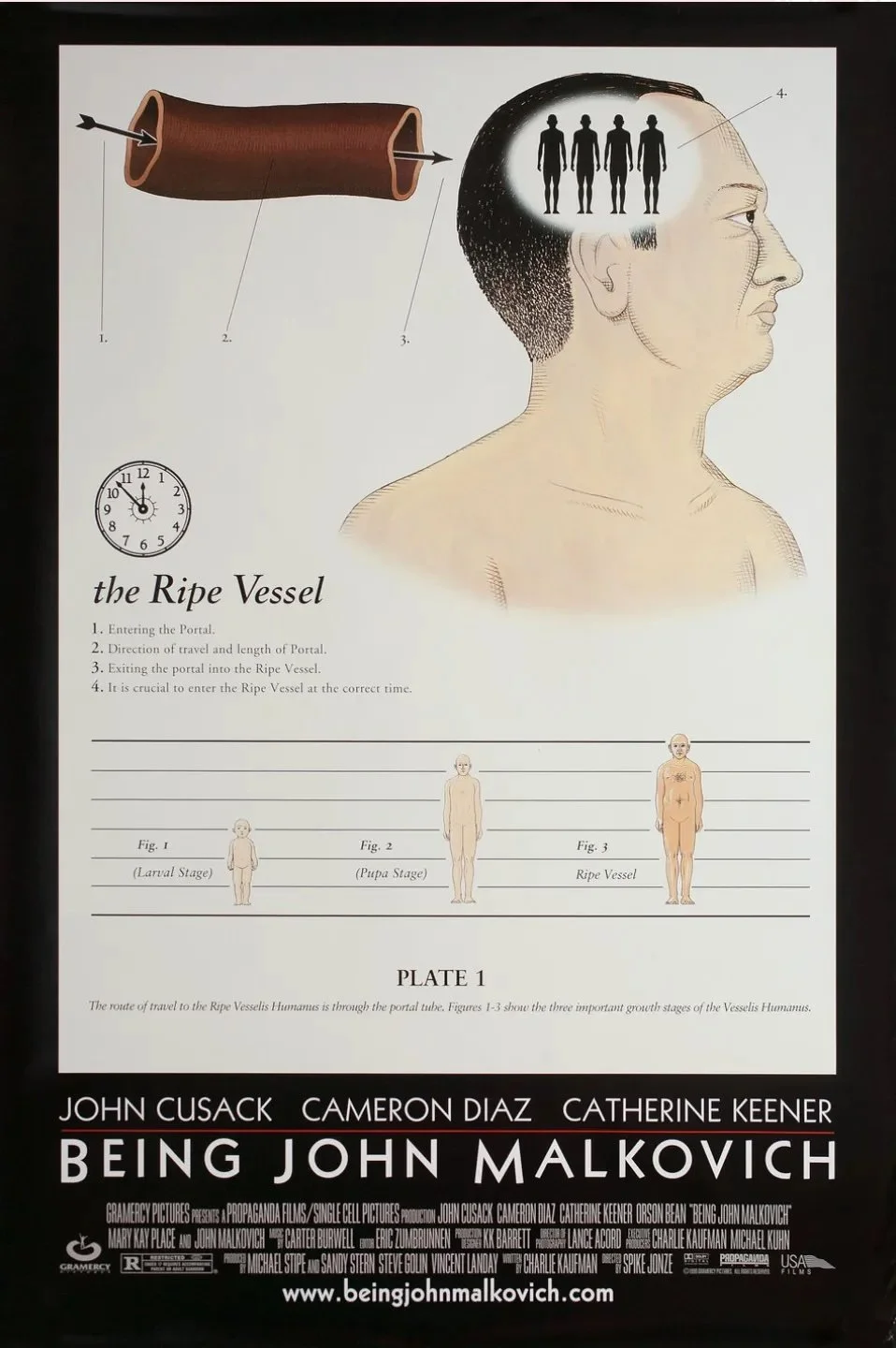
Design by Andy Jenkins (Gramercy Pictures/USA Films)
The poster is, in many ways, the polar opposite of Eyes Wide Shut. There are stars, but they’re almost hidden. Instead, the poster details a key plot point, the mechanics of how one gets inside John Malkovich’s head, leaving out the hole in the wall on the 7 1/2th floor. It’s such an odd, delightful choice (credited to designer Andy Jenkins). Movie posters are meant to sell tickets. Even the Longlegs posters, as abstract as they are, contain recognizable faces. And yet Gramercy and USA trusted the intelligence of their audience (or at least their Times-reading audience) enough to put it out there. I suspect we’ll never see anything like it again.
Which brings us to our last example: the website for Requiem for a Dream, Darren Aronofsky’s 2000 follow-up to Pi. There have been a million creative uses of the internet since, but Requiem set the template for the way in which a film website can convey mood and tone, as well as information.
Anyone who’s seen Requiem knows how oppressive and upsetting the film is. Based on a 1978 novel by Hubert Selby, Jr., the film explores addiction through the lives of four Brooklyn junkies, three of which (Jared Leto, Jennifer Connelly, and Marlon Wayans) are using heroin, and an elderly woman (Ellen Burstyn) who’s hooked on diet pills. Like the film, the website is broken into four seasons, employing stills and sound to give you a sense of what’s at stake. It also uses the language of the web: the site glitches occasionally, and clicking on various spots transports you to what looks like another site entirely. It’s buggy as hell, with pop-ups galore, and at times appears to be disintegrating from within. With Clint Mansell’s score (played by the Kronos Quartet) droning in the background, Requiem’s website is as stunning, arresting, and disorienting as the film itself.
Screenshots from the REQUIEM FOR A DREAM website (Alexandra Jugović)
Needless to say, the site isn’t active anymore, but you can view it here thanks to Alexandra Jugović, the designer who preserved sections of it for posterity. Of the site, she says, “[It] was designed to be an extension of the film on the web and can be enjoyed before, after, or independently of the film. The visitor is a character in the story, gradually losing control as they journey through the site. As the film’s main leitmotif is addiction and decay, the site became in itself a metaphor for it, as it decays the further you progress in the narrative… We wanted to create a site that rots and falls apart the further you progress, until it finally kicks you out.”
Reader, I became a marketer. I worked for three big New York non-profits and am now a consultant. Is cinema the reason why? Maybe. I still love movie marketing, though as we’ve moved into the age of VOD and streaming, clever campaigns have pretty much fallen by the wayside. In 2024 alone, aside from Longlegs, there have been gorgeous posters from companies large and small, including:
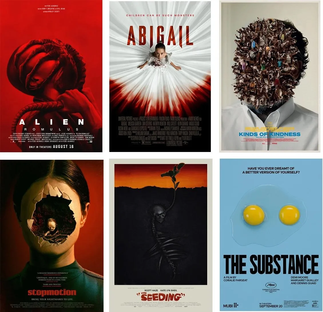
2024 films, Top row, L to R: Alien: Romulus (20th Century Studios), Abigail (Universal), Kinds of Kindness (Design by Vasilis Marmatakis, Searchlight). Bottom row, L to R: Stopmotion (IFC Films), The Seeding (Design by Akiko Stehrenberger, XYZ Films), The Substance (Mubi)
So let’s review. The aspects of marketing I’ve covered — all of which contribute to a successful campaign, and all of which, I’d argue, are necessary today — include (with their examples):
Design: Longlegs, Apocalypse Now, Woody Allen posters, Being John Malkovich
Tagline: Altered States
Title treatment and economy of space: Woody Allen posters
Iconography: Ghostbusters
Billing: Woody Allen posters, Eyes Wide Shut
Guerilla marketing: PiImmersive website: The Blair Witch Project, Requiem
Who knows? Maybe someday we’ll see Christopher Nolan’s name above the title, alongside the names of his stars. Maybe Darren Aronofsky will return to his roots and start painting the town again. Maybe Spike Jonze, who hasn’t made a feature since Her (2013), will surprise us with another poster that confounds and intrigues simultaneously.
Until then, I won’t hold my breath. What’s done is done, and what’s done got me from point A to point B. Thanks, movies.